A chapter,
rebranded
A new mark, a tighter feed, a quieter confidence, a student-led chapter rebuilt around graphic design, consistency, and the way a community wants to see itself online.
The profile mark was redrawn as a typographic system, a serif "Kappa" anchored by a small sans line and a single red heart. Sisterhood treated like a wordmark, not a sticker.
The feed as a single canvas, color, composition, and crop tuned so the grid reads as one piece, scroll after scroll.

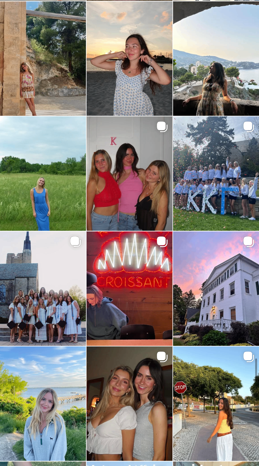
A chapter that looks like itself, a community brand built on care, craft, and a feed worth following.